PRIMARY
SECONDARY
France
Juice
Used in keywords, this cursive font references Oscar’s French origin, evokes handwriting, and adds balance and personality to the visual identity.
A reduced height of 80% is recommended to ensure proportion and harmony in the layout.
EXTRA LIGHT
LIGHT
REGULAR
MEDIUM
SEMIBOLD
BOLD
goodly
BAMBOO
SCHOOL
Visual
Identity
What is it?
The Bamboo School is a space for exchange, connection, and learning dedicated to the bamboo universe.
A recently launched initiative, it offers e-books and practical content. Soon, it will also provide online and in-person courses for those who wish to explore bamboo in design, construction, and sustainability.
Target audience
People interested in DIY
Architects
Designers
Curious, focused on sustainable solutions.
Key-words
Malleability
Connection
Creativity
Circularity
Exchange space
Horizontal approach


For platforms
digital, nothing
communicates more life than the
movement
of your brand.

ANIMATED LOGO
The movement of the bamboo that connects, translated into form and rhythm.
side by side

the vertical version is ideal for:
- Social media profiles
- Packaging and labels
- Portrait format pieces
- Compact printed materials

the horizontal version
works best for:
- Website headers
- Presentations
- Email signatures
- Banners or flags
With both versions, your brand stays adaptable while keeping its identity everywhere.
vertical logo

horizontal logo

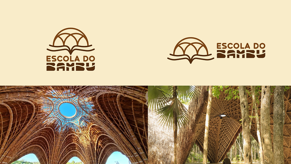
symbology
• Bamboo structure: conveys strength and flexibility..
• Round/Globe shape: also symbolizes connection, the world, and an exchange space.

• Open book:
represents knowledge, study.

• Bamboo movement: flexibility, fluidity and natural lightness.
• Horizontal composition: emphasizes the sense of community and continuity.

• Custom font: reinforces originality and a personal touch.


main vertical version
color palette version
negative version

colors
palette
of


feed
on the
FONTS
in the
practice
contrast of
thickness
contrast of
sources
EXAMPLES
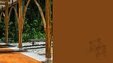
Build with
bamboo
WHAT makes
A
efficient?
logotipe

support
elements
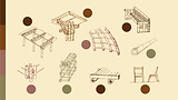
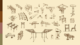
Typographic supporting elements in the visual identity are used to complement, reinforce, or expand your visual communication, while maintaining coherence and unity in the design.

The typographic supporting elements will consist of vector illustrations by Oscar, Head of the Bamboo School.
They will be used, as needed, within the colors chosen for the visual identity palette.
POSTS
Posts are developed with different visual approaches, maintaining unity while exploring the full color palette.


Approach 1:
illustration with image.
Approach 2:
Just illustration.
Approach 2:
only images using the cursive font.


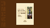
ebook


This visual identity was developed to ensure consistent, lightweight, and impactful applications across digital, print, and physical formats.
Thanks!